

We all know that Shopify platform is being used by the users worldwide, some of them are selling their items, products and services on this platform while others (such as audiences OR clients) are buying useful items, products and services. Shopify is an eCommerce platform, so the main object to make website on this platform is to sale the products in a very easy and best. So when a seller uses this platform, so many questions come in their mind, most important one is – what details to be covered on home page of the Shopify store.
Your website homepage provides 2 important information to the users –
1. An introduction to your brand,
2. A set of instructions meant to help users to find what they need.
This page helps both new and existing customers navigate your stores details to find their goods and items. Your homepage provides the facility to both an introduction to your brand and a set of instructions meant to help to find what they need. This page helps sellers to mark the impression on the audience and engage them to stay on the website and take any actions. You can use this page to sell your products or get email subscribers. So this page has to stand out with clear motive. There is no fixed way to design and work on this page. We have some tips which will help sellers to work on websites and keep this in mind when they think of creating any store.
You have to be clear with the reason before building any store. Here are some of them:
(a) Who is target audience – buyer OR subscriber?
(b) How user-friendly your store is?
(c) Stores should be easily accessible.
(d) How you can make the store so simple for end-user?
A homepage with easy functioning and nice user interface engage the visitors to check out the store and items whether they actually wanted or not. They land on the website randomly or willingly.
Here are the points which you have to keep in mind:
1. “On page” Content:
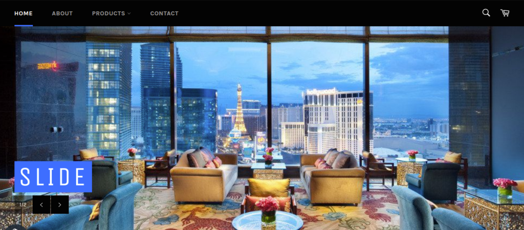
When a visitor lands at any store. The first thing which a visitor can see before scrolling is called the on page or above-the-fold content. Featured your best and most wanted products and services in this section of the homepage.
This content helps visitors to decide that the store is useful for them or not. On this homepage, there are two main decisions that a user can take:
(i) Do they want to make any purchase?
(ii) Do they scroll down for more information to find out the reviews and information about the product’s features and ingredients?
2. Header:
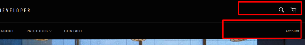
The header should have all the things which a visitor thinks about and wants to go. Visitors can be new or old. Headers have all the redirection links to go and check. Header should contain links for cart, Account page, and Search options.
- Basic Navigation:
Always keep in mind what is the featured navigation which you wanted to show to the user which will not confuse them and not irritate them to choose where to go and what to select.
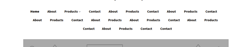
Header navigation should be little and specific. This only recommends users the best way to go and choose the page and products to go and check. This has to be basic and specific.

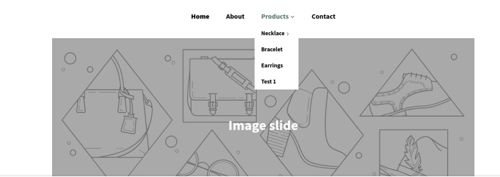
You can use drop-down to show a list of other pages and products under any specific menus.
4. High resolution images:
Use images should be high in resolution and eye-catching for visitors. This image appreciating the limits of user attention will help sellers to emphasize what matters most when designing your homepage. You can use this image on the on page or above-the-fold content. This image will help to sell the products and collect the email leads in the form of subscribers. Can use slideshows with more featured contents on the single space.
5. Call to action:
There have to be some button present which needs to redirect the user directly to fulfill the primary goal. This button can be “Join now”, “Add to cart”, and “Order Now” whatever the steps you wanted to follow.

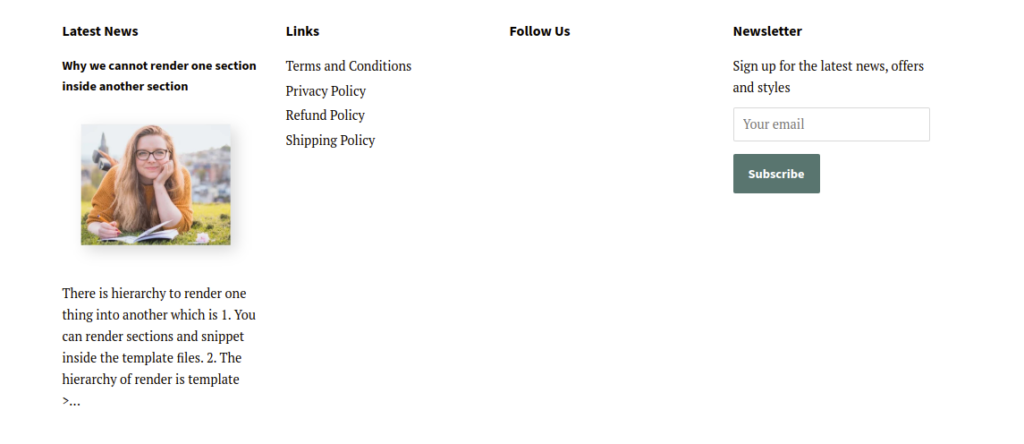
6. Footer:
Footer should contain the links which helps users to get access to the information pages. Latest updates and newsletters to get subscribers list easily.
7. Mobile Design:
Not only desktop design and User interface but also how the store will look on mobile. As we know there are a huge number of visitors there who use mobile for every use most often so the store is also helpful for them also.
Mobile screens should not contain too much area for single information. This will make visitors bored and irritated. Simplifying the homepage content and design to direct users toward a specific set of actions and make them even more important for mobile users.